Introduction

Business Dashboard
Project #1 Business Data Analytics Dashboard
This dashboard project was designed to give business leaders a real-time, visual overview of company performance across services, clients, and revenue. It helps spot trends, track KPIs, and support strategic decisions without relying on scattered reports or manual calculations. The solution was built using PostgreSQL for data modelling, Python for cleaning, and Tableau for interactive visualisation.
Max. profitability, real-time financial insights with AI
KPI Monitoring with Custom Alerts and Insights
ETL Processes, PostgreSQL, Python, Pandas, Tableau
VIDEO Presentation

about the project start
My Role at the Company – Summary and Impact
I was part of the founding team at a small, startup-style European company with two branches: software development and IT education. We created digital products and delivered training services such as programming bootcamps, code audits, and business coaching.
My role started in marketing as an Online Marketing Manager, but quickly grew into a broader analyst and strategist position. While working there, I studied at university and earned a degree in Business Informatics Engineering, a field that combines computer science, data, and business. This education helped me shift my role inside the company. I worked across departments to collect, analyse, and use data to support smarter decisions and improve performance.
My Key Contributions and Achievements
Collected & Analysed Business Data
Analysed business data across 2 software products and 7 educational services, reaching over 300 customers. Delivered insights from online marketing, sales, customer feedback, and operations using custom-built surveys, interviews, and automated pipelines. Enabled 21% revenue growth by identifying underperforming funnels and optimising service offerings.
dashboards for data driven decisions
Developed interactive dashboards for product and training teams using Power BI, Tableau, and Google Analytics integrations. Helped identify 3 key customer segments and optimised content strategy, leading to a 24% increase in engagement. Highlighted high-performing services contributing to 40% of total revenue.
Saved Time and Other Resources
Automated recurring manual tasks including reporting, survey analysis, and campaign tracking. Saved 10+ hours per week, equivalent to 40+ working hours monthly, allowing teams to focus on strategy and execution. Reduced manual errors by 45% and accelerated reporting timelines.
Used AI tools for reporting & Insight
Integrated AI-powered analysis and prompt engineering to enhance data interpretation and visual storytelling. Recommended performance improvements that contributed to a 33% increase in operational efficiency and a 17% drop in cost-per-click (CPC). Delivered executive-ready insights through automated natural language reporting.
Why I designed this Business Dashboard?
As the company grew, it became harder to track performance using spreadsheets, scattered reports, or conversations. We had two business areas — software development and IT education — each with different services, clients, and goals.
I saw an opportunity to create a central dashboard to help the team:
-
Get a clear, real-time overview of business health
-
Make faster, data-driven decisions
-
Spot trends and issues early (e.g. drop in revenue, rising client churn)
-
Save time on monthly reporting and reduce errors
-
Support strategic planning across both business units
Many of the numbers we needed were already available on computers, such as in our finance system, booking tools, sales records, and client lists. That’s why it made sense to use existing digital data, clean the data, and make it visible in one place.
How I Identified the Required Data
My Thinking Process
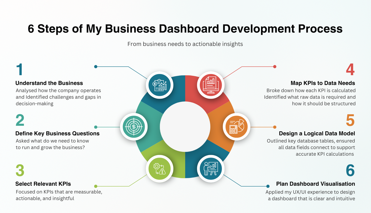
To build a meaningful dashboard, I worked backwards, starting with the business questions, then identifying the KPIs that help answer them. Once I had the KPIs, I broke down how each one is calculated, and what raw data is needed to compute them.
Identifying key questions and KPIs
Each KPI was chosen based on:
-
Its relevance to decision-making
-
The availability of data in the company’s financial and operational systems
-
Its value across multiple departments (sales, training, marketing, finance)
Questions and the KPIs to answer them:
1. Which services are most profitable?
-
Revenue per Service
-
Cost per Service
-
Profit per Service
-
Profit Margin (%)
2. Where are we losing clients or money?
- Client Churn Rate
- Lost Revenue
- Client Feedback Score (CSAT/NPS)
- Training Attendance Rate
3. How are we growing over time?
-
Monthly Recurring Revenue (MRR)
-
New Clients per Month
-
Revenue Growth Rate
-
Client Growth Rate
4. Is our training effort paying off?
-
Sessions Delivered
-
Revenue from Training
-
Repeat Training Bookings
-
Training Feedback Score
5. How can we saving time and reducing manual work?
-
Automation Time Saved
-
Reporting Time per Month
-
Task Completion Rate
-
Dashboard Usage Rate (optional)

How I Collected the Data
My Thinking Process
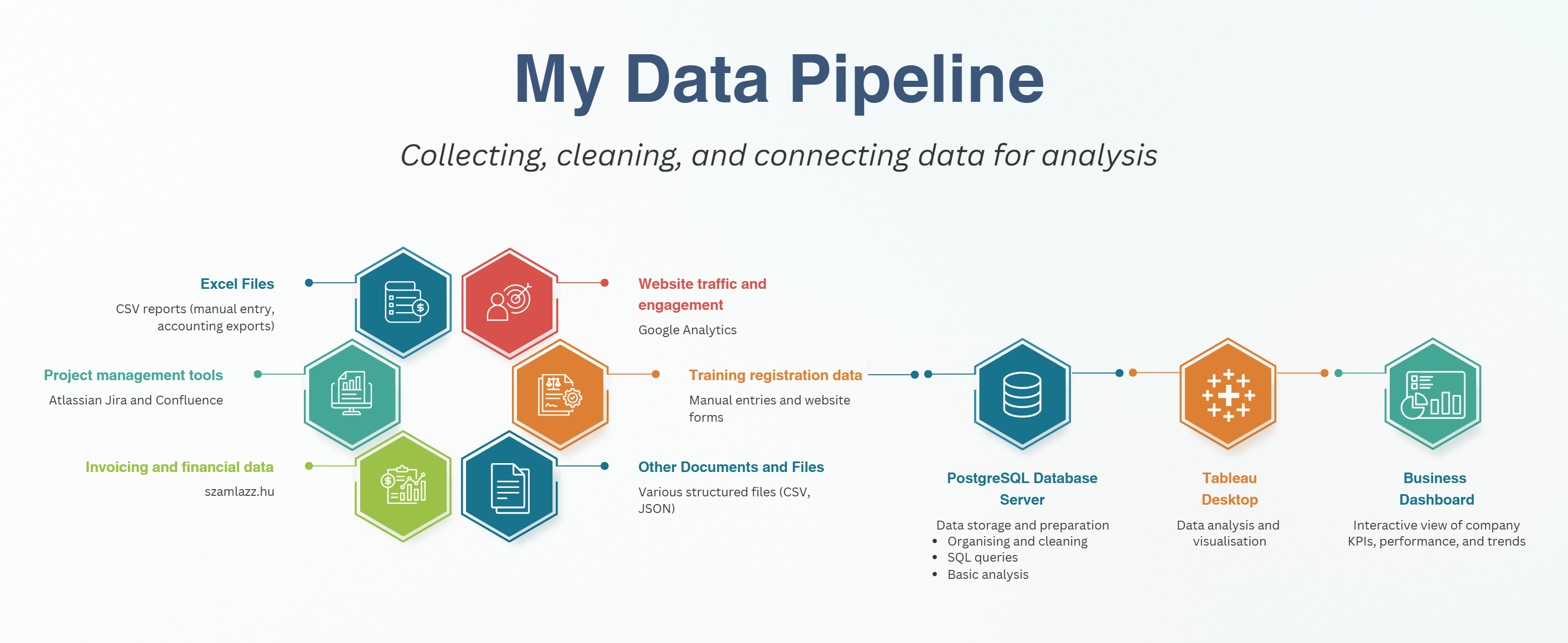
I collected data from multiple business sources, including spreadsheets, Jira, Google Analytics, and accounting software, by exporting CSV files and preparing them for analysis in PostgreSQL.
Where was all the data sourced from?
-
Excel Files (CSV Reports): Manual exports from accounting tools and business logs
-
Project management tools (Atlassian Jira and Confluence): Exported task, project, and time reports (CSV, JSON).
-
Invoicing and Financial Data (szamlazz.hu): Downloaded invoice records as structured files, cleaned and formatted them, and integrated into relevant financial tables (e.g.sale)
-
Website Traffic (Google Analytics): I connected with the API to collect user activity metrics and processed them to gain insights into engagement related to services and training.
-
Training Registration Data: Manual Excel entries and website form submissions
- Other Documents and Files: other structured files were processed and joined with core tables using identifiers like client_id, service_id.
How did I use APIs
To integrate website traffic data into my dashboard, I connected to the Google Analytics Data API (GA4) using Python. Once the data was returned in JSON format, I converted it into a structured Pandas DataFrame, cleaned the column names, and transformed the metrics into the correct data types. I then loaded this cleaned data into my PostgreSQL database, where it could be joined with other business data and visualised in Tableau.
For the Python code, please visit my GitHub site: My Projects on GitHub
How I Organised and Analysed the Data
My Thinking Process
How I Organised the Data
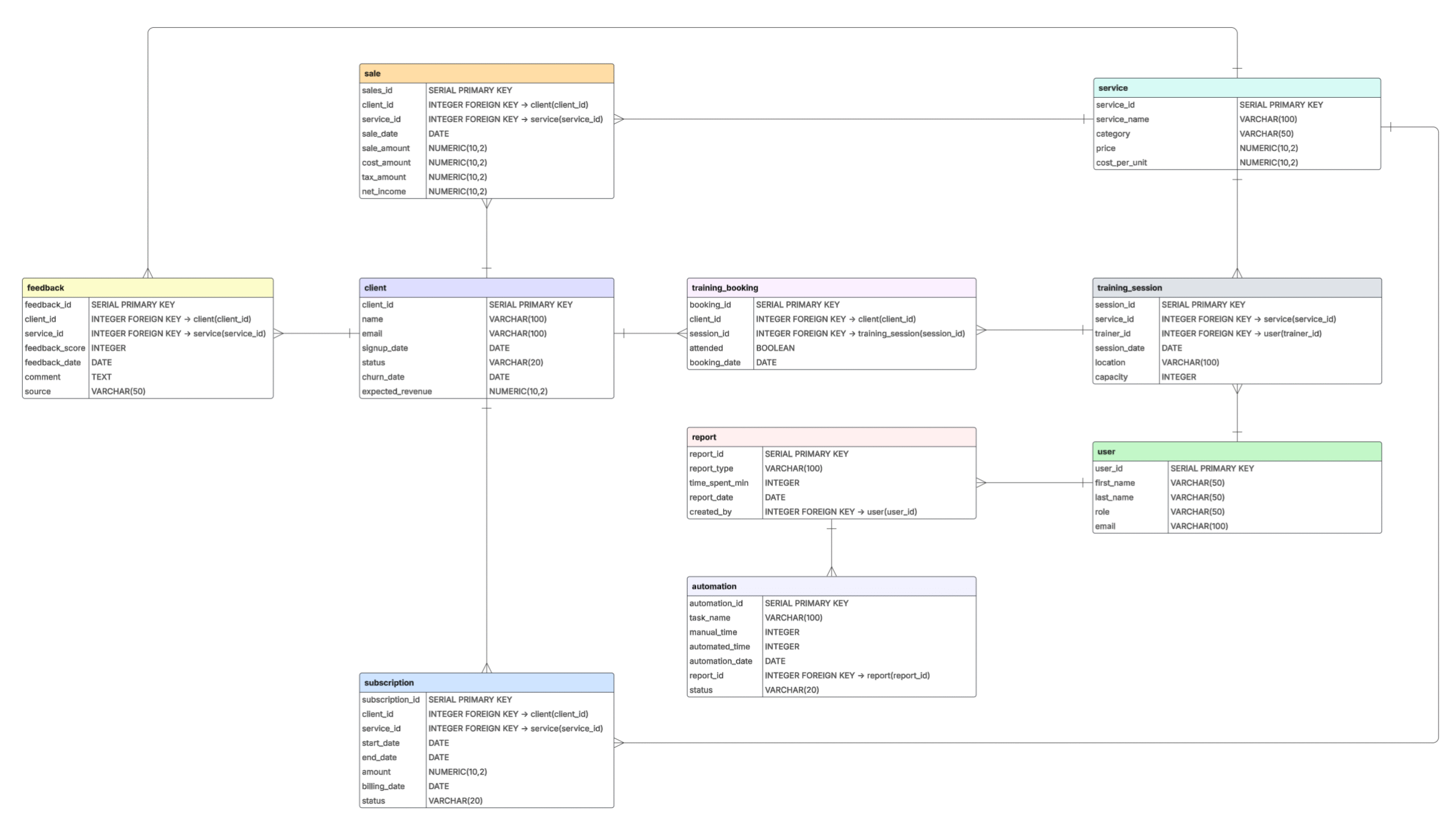
I created the table plans by designing an Entity-Relationship Diagram (ERD) in LucidChart. First, I identified the key business entities based on the KPIs I wanted to measure, such as clients, services, sales, and training sessions. Then I defined the relationships between these tables and added primary and foreign keys to ensure a logical data structure. Each table was planned with relevant fields and data types to support analysis in PostgreSQL. This diagram served as the blueprint for building a clean, efficient, and scalable relational database.
How I Analysed the Data
1. Structured the Data in PostgreSQL
After importing the data into PostgreSQL, I performed:
-
-
Normalisation and table relationships (using foreign keys)
-
Handling missing and inconsistent values
-
Date conversions and data type alignment
-
Calculated fields such as profit margin, churn rate, and session attendance
-
2. Exploratory Data Analysis (EDA)
I wrote SQL queries to:
-
-
Summarise trends (e.g., revenue by month, sessions delivered)
-
Filter and group data by categories (e.g., service type, client segment)
-
Detect outliers and validate assumptions
-
3. KPI Calculations and Metric Design
I created queries for each KPI, ensuring the logic was consistent with business goals (e.g., calculating Monthly Recurring Revenue (MRR), Net Income, and Task Automation Savings).
4. Dashboard Design in Tableau
I visualised insights using:
-
-
Bar charts, line charts, and KPIs for trends
-
Filters and parameters for interactivity
-
Storytelling elements to guide business users through the findings
-
5. Validation with Stakeholders
I presented early dashboard versions, collected feedback, and iterated to ensure the results answered the right questions and supported decision-making.
SQL Examples from the Project
The business question was: Which services are the most profitable?
The KPIs
-
Revenue per Service
-
Cost per Service
-
Profit = Revenue – Cost
-
Profit Margin (%) = Profit / Revenue
SQL Queries

My answer to this question is as follows:
The Junior Java Programming Course clearly stood out, with a 66.67% profit margin and the highest overall revenue (76.8M HUF). This indicates strong market demand and efficient cost management. Business Coaching also performed very well, achieving a 62.50% margin, despite being a lower-volume service. Other services, such as Frontend Bootcamp and Code Audits, were still profitable but with lower efficiency.
My recommendations based on the results are for example:
- Scale the Junior Java Programming Course: It combines high demand with excellent margins. Increasing the number of sessions, offering advanced versions, or building corporate packages could amplify both reach and revenue.
- Promote Business Coaching as a Premium Offer: With a strong margin and lower delivery costs, this service is a high-value, low-risk option, and targeting executive clients or bundling with training could add strategic value.
Future Results
Following my analysis, the company implemented my recommendation to scale the Junior Java Programming Course. Within the year, they launched corporate packages and introduced advanced and senior-level versions of the course. These new offerings were well-received, significantly increasing revenue from training services and strengthening long-term client relationships.
How I Created the Business Dashboard
My Thinking Process
I designed the dashboard in Tableau based on predefined business questions and KPIs. I connected Tableau directly to my PostgreSQL database, where the cleaned and structured data was stored. I created calculated fields, applied filters and parameters, and used visual best practices to ensure clarity and usability.
I iterated the layout using my UX/UI background, focusing on readability and business relevance. The final dashboard provides a real-time, interactive view of key metrics for performance monitoring and strategic decision-making.
Defined the Dashboard Layout
To create a clear and insightful dashboard, I followed a structured design process that combined UX principles, business logic, and visual storytelling.
1. Sketches
I began by sketching the layout, using tools like Miro to visually map each business question to its corresponding KPIs. This helped ensure that the dashboard was focused on real strategic needs rather than just data display. Each KPI was tied directly to a business goal—such as tracking profit margins, client churn, or training impact—which shaped the structure and flow of the dashboard.
2. Design
Once the logic and content were mapped, I used Figma to design wireframes and mockups. This step allowed me to experiment with layout ideas and structure the content in a way that would be intuitive for decision-makers. I applied my UX/UI experience to prioritise visual clarity, ensuring that the most important KPIs appeared at the top, with supporting metrics grouped logically below them. This top-down design supports quick scanning and action-oriented insight.
With the layout defined, I strategically selected visual types that best matched the nature of the data:
-
Line charts were used to show trends over time, such as revenue growth or client acquisition, offering a clear view of business progress.
-
Bar charts were ideal for comparisons, such as analysing profit by service type.
-
Scorecards and KPI boxes were placed prominently to highlight single key figures, like churn rate or number of active clients.
-
Tables were used to present detailed, sortable lists—such as feedback entries or upcoming training sessions—providing context where needed.
3. Tableau
The dashboard was then developed in Tableau, where I connected it directly to the PostgreSQL database that held the cleaned and structured data. I created calculated fields for metrics like profit margin, growth rate, or time saved, and added filters and parameters to allow users to explore different segments, services, or time periods.
4. Iterations
Finally, I iterated the dashboard based on stakeholder feedback and visual clarity tests. This included adjusting chart types, refining layout spacing, simplifying labels, and ensuring all elements supported the original business questions. The result is a dashboard that is not only visually engaging, but also deeply tied to business goals, offering real-time insight and supporting strategic decisions across departments.

Publish and Presentation
After completing the dashboard design and analysis, I focused on presenting the results in a clear and engaging way for both technical and non-technical audiences. The project was also version-controlled using GitHub, where I documented the ER diagram, scripts, data cleaning and analysing steps.
VIDEO Demo Presentation
In this short video, I present the business analysis dashboard I designed and built, explaining the goals, data sources, key KPIs, and how the final Tableau dashboard supports decision-making. For the video, please visit my YouTube Channel: My Projects on YouTube
Disclaimer
This project presentation uses mock data to respect the confidentiality of the company I worked with. Some elements of the business story and structure have been modified or simplified at the company’s request. However, all content shown on this page has been reviewed and approved for public sharing. The analysis, structure, and dashboard design reflect my real work and problem-solving process.
What Did I Learn
My Thinking Process
This project was a turning point in my growth as a data analyst. I started with beginner-level knowledge and, through solving real business challenges, I developed a much deeper understanding of end-to-end analytics.
Here’s what I gained:
-
How to define clear business questions and translate them into measurable KPIs
-
How to design a structured database schema and work with relational data
-
How to clean, transform, and analyse data in PostgreSQL and Python
-
How to design dashboards with a strong user experience focus
-
How to communicate results visually using Tableau
-
How to manage a full data project from planning to presentation
-
How to think like a business analyst, not just a technician
What’s Next?
My Plans for the Future
This project gave me strong foundations in business analysis, data modelling, and visual storytelling. Since completing it, I’ve explored how to integrate AI tools into data workflows. My next goal is to deepen my expertise in Python, and I also plan to continue exploring AI technologies, as this area is rapidly evolving and offers exciting opportunities in data analytics.


